
No Small Task
The company came to us looking for a complete website redesign.
Infinite Solution offers a wide range of technologies suitable for everything from small homes to large buildings, development projects, and office spaces. As a result, their service portfolio and target audience are very broad.
The website itself included around 70 subpages and was also available in English, which meant a significant amount of work for us.
The overall website structure was overly complex. Pages often led to multiple layers of subpages, which made the navigation unnecessarily difficult for visitors.
The website had a large amount of text, all of which required new copywriting, as it either didn’t communicate anything useful or was too long and overly complex.
The website design was also outdated, and the navigation wasn’t intuitive. In addition, the client asked for the new website to be available not only in Czech and English, but also in French, and to be easily discoverable from France.
So we got to work.
The goals were to:
Simplify the website structure
Completely rewrite all website content
Ensure easy discoverability in France
Step by Step
We redesigned the entire website structure to make it clear, easy for users to understand, and not unnecessarily complex.
We decided that visitors should be able to reach any information within a maximum of two clicks.
This meant reworking the entire website structure by gathering all the information from the original site in one place and reorganizing it into clear topics.
For example, the original website included a Smart Building service, which covered the implementation of various technologies such as smart lighting, AI-powered security cameras, automated heating, and more.
The problem was that, for example, the smart lighting subpage contained multiple layers of sections and subpages, while also linking to pages that weren’t closely related to lighting.
On the new website, each service leads to clearly defined final subpages, such as smart lighting. From these pages, users can only navigate to the inquiry form or to the previous or next section within the same service, such as automated heating.
We started by proposing three different homepage styles, one of which the client selected. We then used this style as the basis for refining the rest of the website pages.

Old Hero Section
The text doesn’t explain what the company does.
Overly abstract image
Both CTA buttons have the same meaning
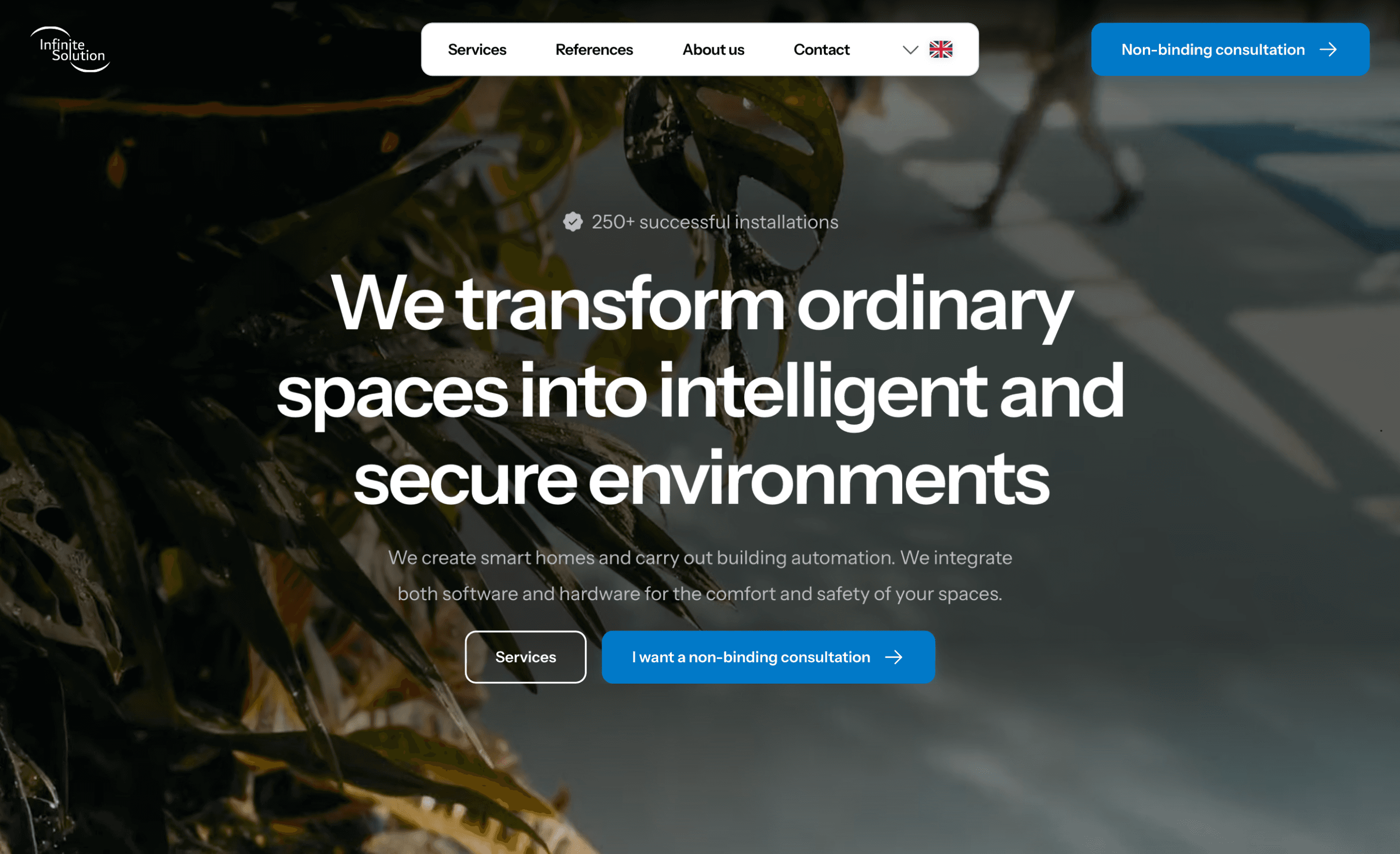
New Hero Section
The text clearly explains what the company does
Relevant video featuring building technologies
CTA buttons with a clear purpose
From Chaos to Clarity
We organized the entire structure.
Each technology was grouped under its respective service.
One technology. One topic. One page. Simple.
What was once a large, complex menu was simplified into four main services: Smart Home, Smart Building, Smart Security, and Tailored Solution.
Each service then includes its own subtopics, such as lighting, blinds, heating, and more.
The entire navigation became clear and, most importantly, predictable for users.
One of the core principles of web design is predictability. Navigation and structure should be consistent across the website, so users know that when they click a specific button, they’ll get exactly where they want to go.
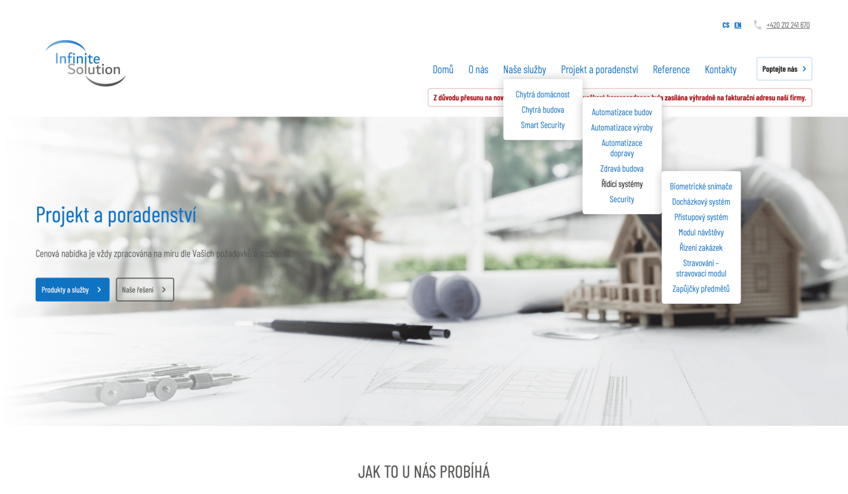
The old menu clearly showed how overly complex the website was. On top of that, the menu was frustrating to use, as it kept closing and behaved in a user-unfriendly way.

The new menu sits under each main service. The individual technologies within each service are clearly organized, making it easy for visitors to find exactly what they’re looking for.
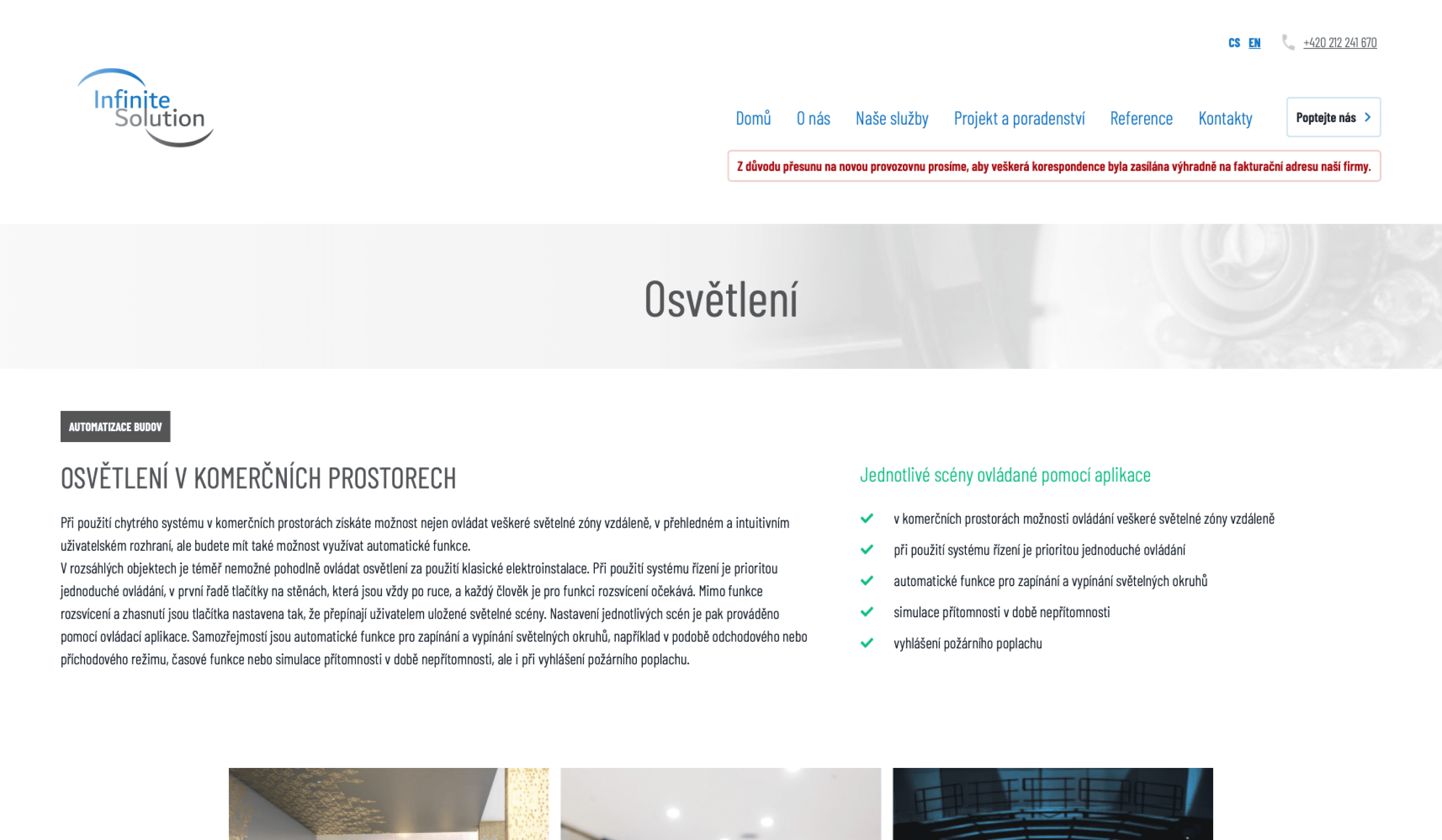
Each technology subpage was completely redesigned from scratch.
We extracted the key information from large blocks of text and turned it into clear bullet points with relevant icons and short explanations of what each technology does and includes.
Old subpage for a specific technology. In addition to its outdated design, it featured cluttered text blocks and links to many other sections. On top of that, each technology page was structured differently, making it unnecessarily confusing and hard to follow.

A new section for each specific technology, containing only an intro text, an image, feature bullet points, and links to the previous or next technology within the same service. A unified, predictable design that doesn’t confuse visitors.
We went through the old website page by page, selected all the important information, organized it, and transferred it to the new website.
We completely rebuilt all subpages from scratch.
We also designed the website to be easily discoverable and to guide visitors toward filling out the form, which is the website’s primary goal.
Well-Structured Website
We then translated the website into English and French and optimized it. Finally, we handed the website over to the client and launched it together.
The new website now:
Has a clear and simple structure
Includes clear and useful content
Is easily discoverable from France
New website performance statistics based on Google and GTmetrix
Performance
Accessibility
Best practices
SEO
The new website for the international company Infinite Solutions now serves as a useful tool and a solid investment. Anyone directed to the website can easily understand what the company does, what it offers, why customers should choose it, and how to get in touch. Infinite Solution can now confidently present itself with a clear, well-structured website it can truly be proud of.
