
An Underperforming Asset
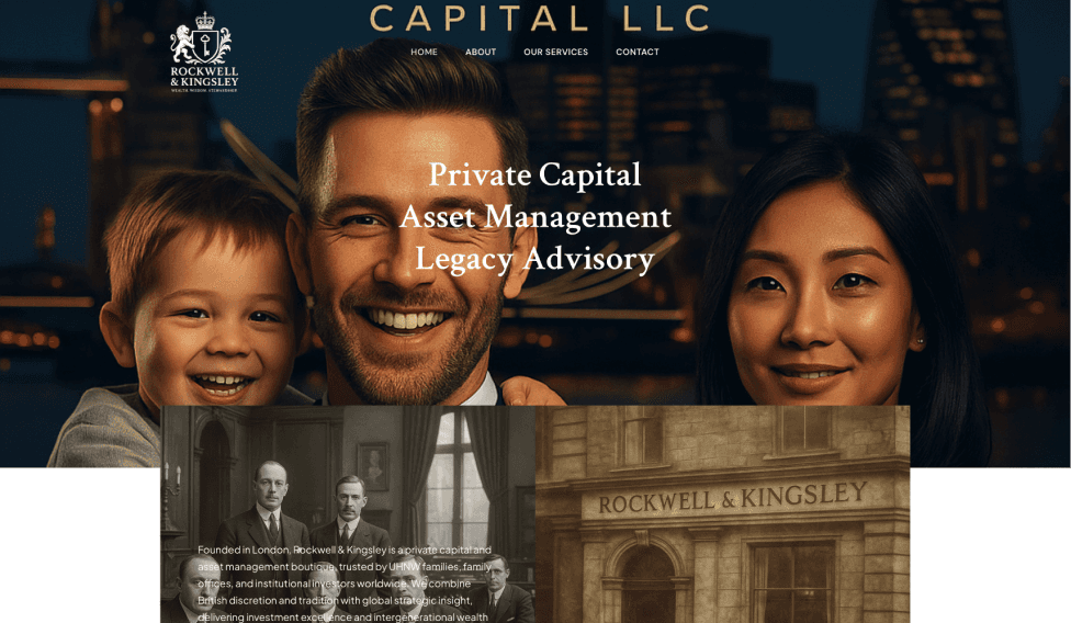
The original website didn’t feel credible or polished and lacked personality. It had no clear sections, a cluttered design, and text that was hard to read and sometimes incomplete.
Since this is the website of a global private bank founded in London, the client asked us to reflect an Old English style, using dark blue and gold elements to convey prestige.
Additionally, since Rockwell & Kingsley has a branch in Dubai where Arabic is the primary language, the client requested the website to have two language versions: English and Arabic.
Lastly, a dynamic CMS (content management system) was needed to manage PDF documents, allowing the client to add or remove files such as terms and conditions or other legal documents, which users can view directly on the website without having to download them.
With the direction and materials provided, we got to work.
The goals were to:
Reflect an Old English style on the website
Present the bank’s services credibly in two languages
Allow the client to independently add or remove PDF documents
A Clear Welcome
When a user visits the website, it should be immediately clear where they are, making them think: “Yes, I’m in the right place.”
The previous homepage was messy, the text difficult to read, and there was no clear call-to-action to guide visitors on how to open an account.
We designed the new Hero section to make it clear that the site offers banking services. On the right is an image suggesting a private “community,” while on the left is text explaining that it’s a bank and what services it provides.
Old Hero Section
Cluttered page layout
Hard-to-read text
No clear call-to-action
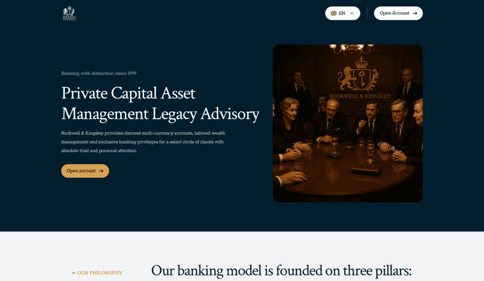
New Hero Section
Clear Hero section layout
Easy-to-read text
Strong, clear call-to-action
Other Sections of the Website
Just like the Hero section, we designed the entire site in an Old English style. In addition to the dark blue and gold, we added brown elements reminiscent of wood or leather - a detail that reinforces the overall style. We also added a PDF viewer and a dynamic system that allows the client to easily add or remove any PDF document at any time. Here are examples of some of the sections that received a redesign.

The previous company values section looked dull and ordinary. Below it was a poorly readable, unfinished CTA section.

The new section clearly highlights the core values that Rockwell & Kingsley bank is built on.
The entire old website followed this chaotic style. Users had almost no chance to navigate the site, let alone build any trust in the bank.

The old section told the bank’s story and explained its approach. If the website is confusing, visitors won’t bother trying to understand it and will simply leave.

The new section clearly introduces the bank to potential clients and motivates them to take the next step with a call-to-action - opening an account.
We fine-tuned the entire new website down to the last detail, ensured it looks great on any device, optimized it for search engines and social media, improved its performance, and translated it into Arabic.
Tradition, Reimagined
The entire website is now structured so that users can easily navigate it, while reflecting the bank’s style, values, and story.
The new website now:
Reflects an Old English style, honoring the bank’s roots
Clearly presents the bank’s services in English and Arabic
Lets the client add and show PDF documents easily
New website performance statistics based on Google and GTmetrix
Performance
Accessibility
Best practices
SEO
We handed the website over to the client and launched it. The new site now presents the global private bank in the Middle East, highlighting its London roots and its expansion into Dubai.
