
We Built It from the Ground Up
The company came to us asking for a redesign of the website that had been created by another studio. That studio could make nice graphics for marketing materials, but unfortunately couldn’t deliver a useful, high-performing, and scalable website.
The main challenge was presenting a wide range of services to a broad target audience, as we identified during the initial meeting.
The company offers services ranging from minor property renovations to full-scale construction, serving both B2C clients as well as developers, businesses, and investors.
This complicates the website design, because the broader the target audience and range of services, the harder it is to ensure that every visitor finds the information they’re looking for.
Although the company already had a basic website, it didn’t clearly communicate what the company offers or who it’s for.
Another issue with the original website was that it didn’t stand out or feature any memorable elements that would represent Konstrux.
The goals were to:
Ensure that every visitor reaches the right information.
Clearly present a wide range of services.
Make the website stand out with elements that show what the company does.
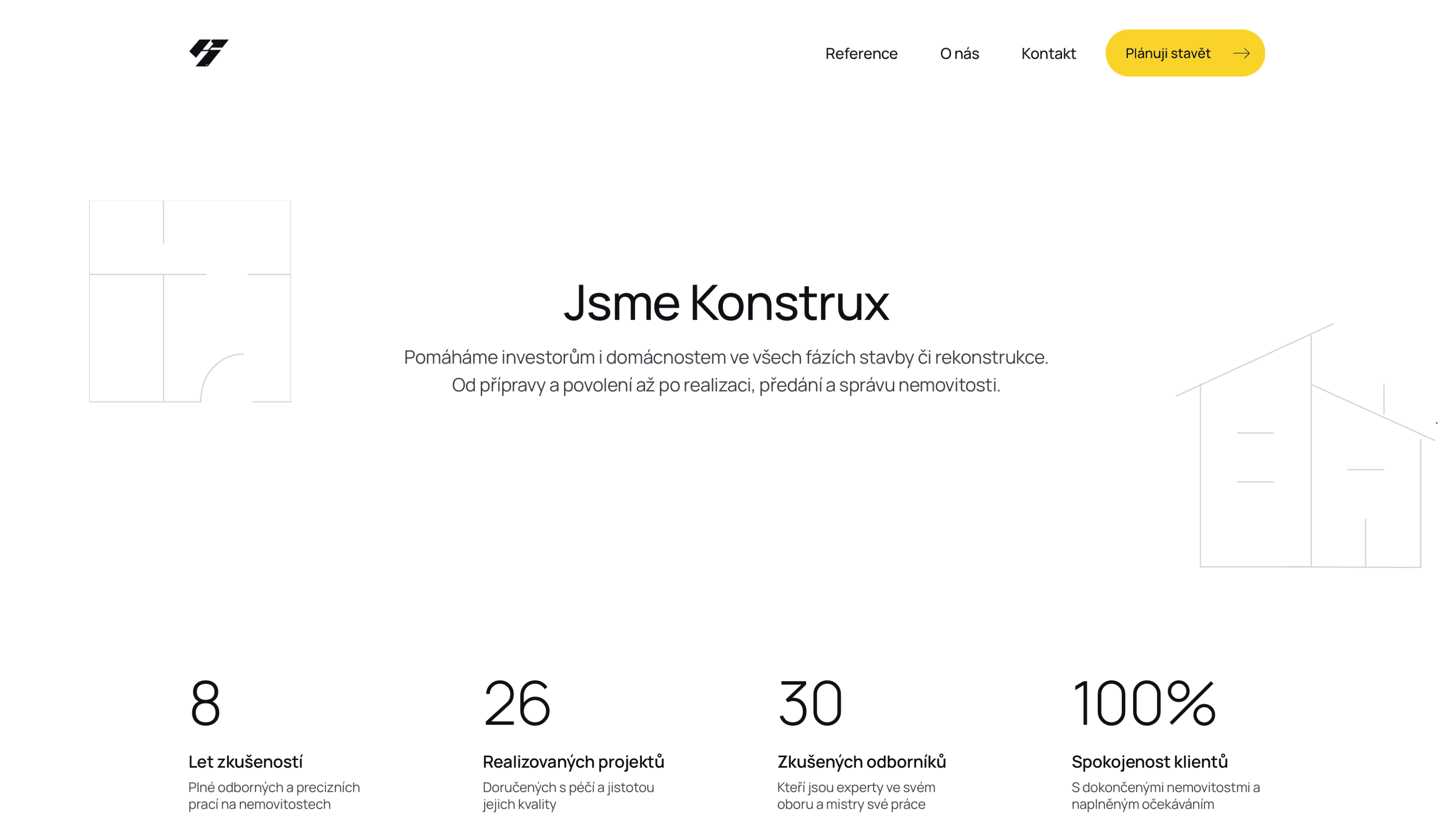
Brand-New Entrance
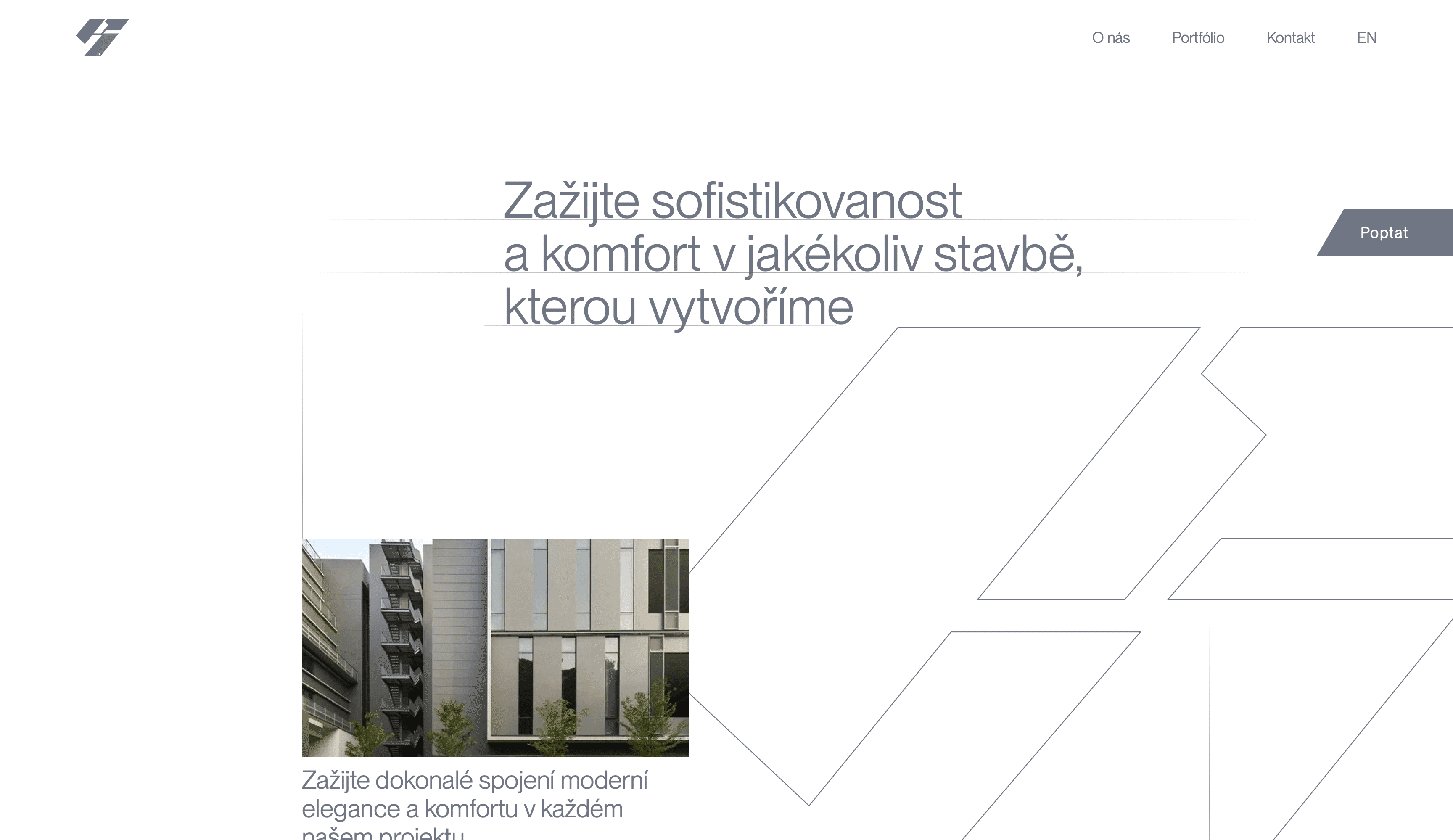
First impressions are key, and that’s exactly what the Hero section is for - like the entrance of your website.
The Hero section is the first part of the website a visitor sees. It should help people understand what the company does and make a strong first impression, because visitors form an opinion within the first few seconds.
The previous Hero section used abstract text that didn’t clearly show what the company does or which website the visitor was on.
Some websites may use only neutral colors (black, white, and shades of gray), but they need to be used effectively - which wasn’t the case here.
The site also lacked a clear call-to-action - no button or noticeable element to guide visitors toward taking action.
In the new Hero section, we included an image suggesting construction work, a bold and clear button directing users to fill out the inquiry form, text explaining what the company does and who its services are for, and organized the section into a familiar layout that visitors are used to.
Old Hero Section
Visitors can’t tell right away what the company does
It has a weak and generic call-to-action
The layout is messy and hard to follow

New Hero Section
Visitors can instantly tell it’s a construction company
It has a bold and clear call-to-action
It’s clear and easy to read
The Company’s New Facade
With a wide range of services and a diverse target audience, it was necessary to guide each visitor to the right place.
This means directing developers to developer-focused information and services, and homeowners to household-focused information and services.
We solved this problem by dividing the website into two main sections, one for each audience.
When a new visitor comes to the website, right after the Hero section they can choose which group they identify with - “I’m a developer” or “I’m a homeowner.” In these sections, they find exactly the information they’re looking for.
Right after the Hero section is the services section, one of the most important parts of the website, so it should be clear and easy to see.
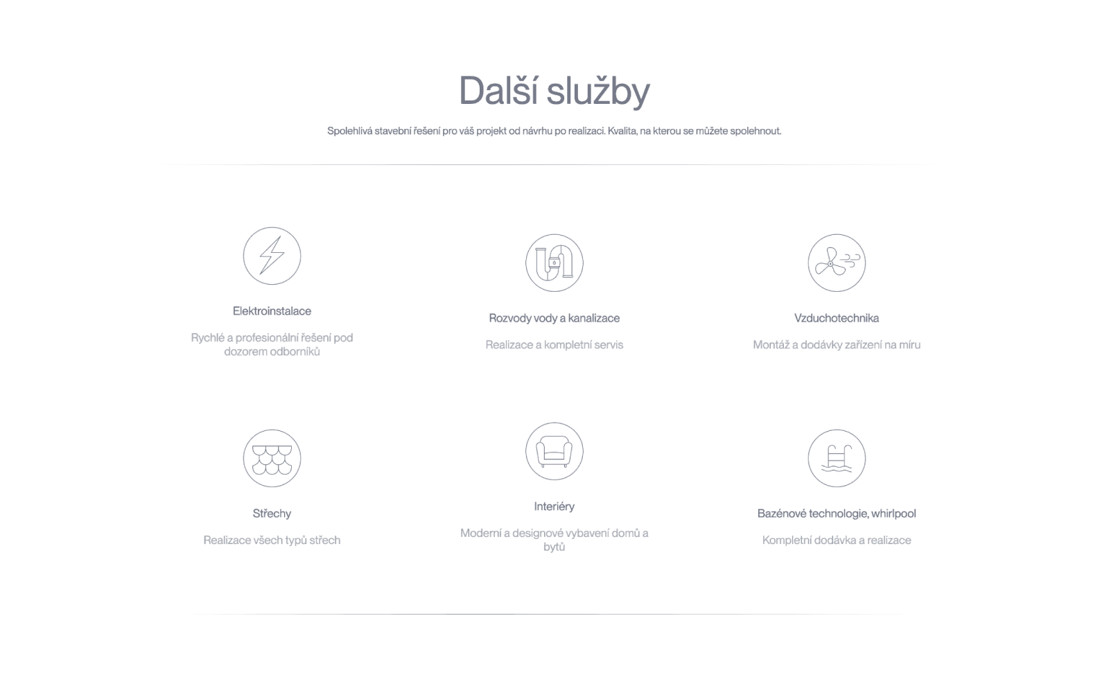
The old services section grouped all offered services into a single category, regardless of the target audience. The section was unremarkable, and the texts were very brief.
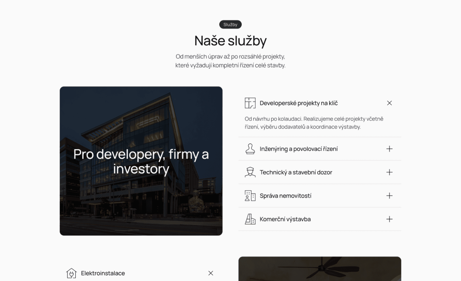
The new services section is clear and divided by target audience and features more detailed texts, so everyone can find and understand exactly what they’re looking for.
The original website consisted of uninteresting visuals, a random layout of sections, and meaningless text.
We built the new website from the ground up. We chose a primary color, planned the pages and sections, organized services into clear categories, and added a system for adding client references, so the client can easily add new testimonials anytime.
We also added themed copy and simple construction-style icons with thin lines to each page and key sections, giving a feel of hand-drawn construction plans.
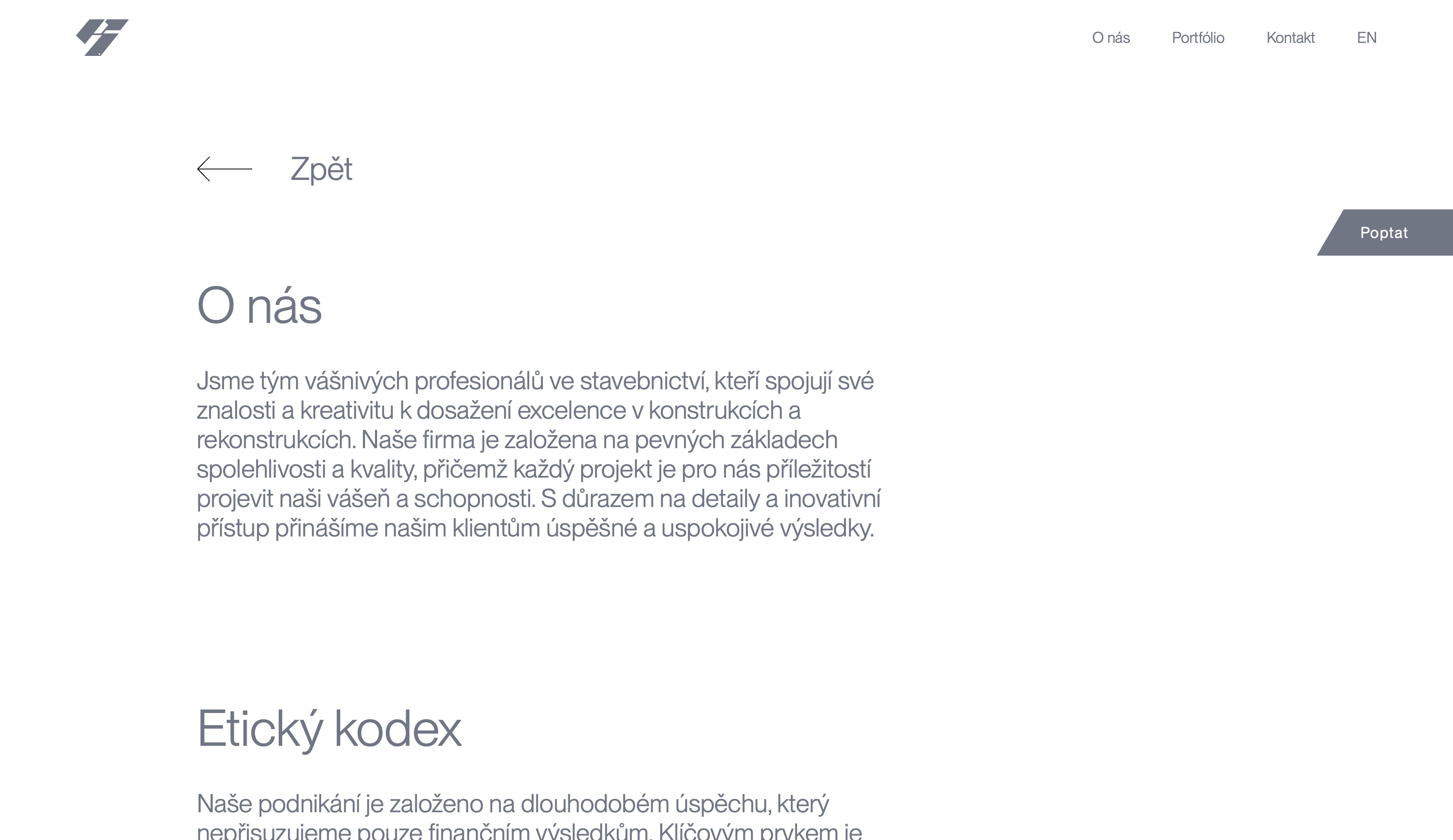
The previous “About” page featured dull visuals and vague text that didn’t inspire trust or engage visitors.
The new “About” page catches the eye immediately and guides users to fill out the form with a clear CTA button in the header.
Along with the new homepage, we built an “About” page, a contact page, a form submission page, and a references page that the client can easily update, remove, or expand with new projects through a simple admin panel.
Project Successfully Completed
With the client, we polished every detail, optimized the site for performance, added basic SEO, and launched it in just a few minutes.
The new website now:
Guides every visitor to the right information
Clearly presents a wide range of services
Reflects the company’s activities with an original design
New website performance statistics based on Google and GTmetrix
Performance
Accessibility
Best practices
SEO
Konstrux now proudly presents its new, unique website and can easily add more satisfied clients to its clear portfolio of references.
